03 // Real Estate
Mayfair Estates
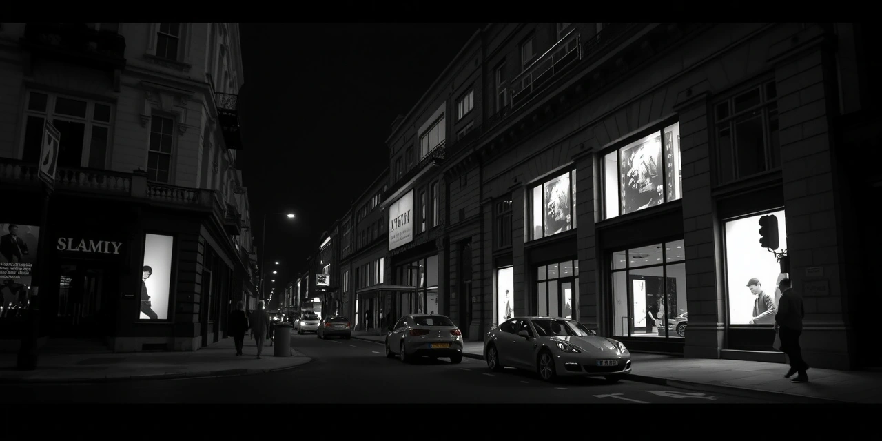
Strategic use of muted palettes and Islington-inspired greys for high-end property development sites.
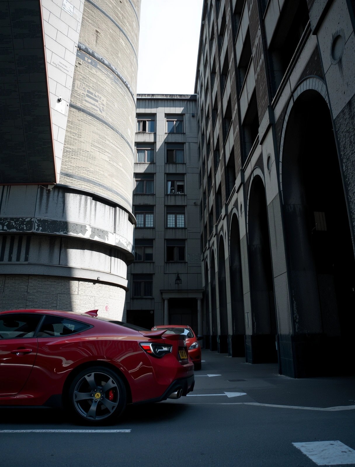
A rigorous documentation of digital builds where technical logic meets aesthetic desolation. We do not design for the masses; we engineer specialized interfaces for London’s high-conviction brands.
Enter ArchiveCOORD: 51.5285° N, 0.0881° W
STATUS: MISSION_CONTROL_ACTIVE
UPTIME: 99.98%
For a luxury dental surgery in Marylebone, the challenge was to move away from generic "smiling patient" imagery. We utilized excessive white space and high-resolution macro photography to create an environment of sterile, professional calm.
The project required a balance between high-fidelity visual assets and immediate load times for patients booking on mobile devices in low-signal areas of the Underground. By implementing custom image-serving logic, we reduced the initial payload by 64% without sacrificing detail.


Adapting a traditional architectural portfolio for the mobile screen is not about downsizing grids, but about re-imagining the vertical promenade.
"The portfolio became a digital monograph. We prioritized vertical scroll speed as a narrative device—simulating the feeling of walking past a façade."
For a London-based RIBA studio, we eliminated the classic "image gallery" in favor of an interleaved editorial layout. Every image is contextualized with technical specs: location, materials, and floor area.
We implemented a "low-gravity" parallax effect on structural details to elongate the visual impact on mobile devices, ensuring the user lingers on the craft before moving to the next section.
Strategic use of muted palettes and Islington-inspired greys for high-end property development sites.
Mobile-first navigation for a Shoreditch fashion boutique simplifying 400+ product categories.
Responsive grid systems for data-heavy sites, maintaining readability across all handheld formats.
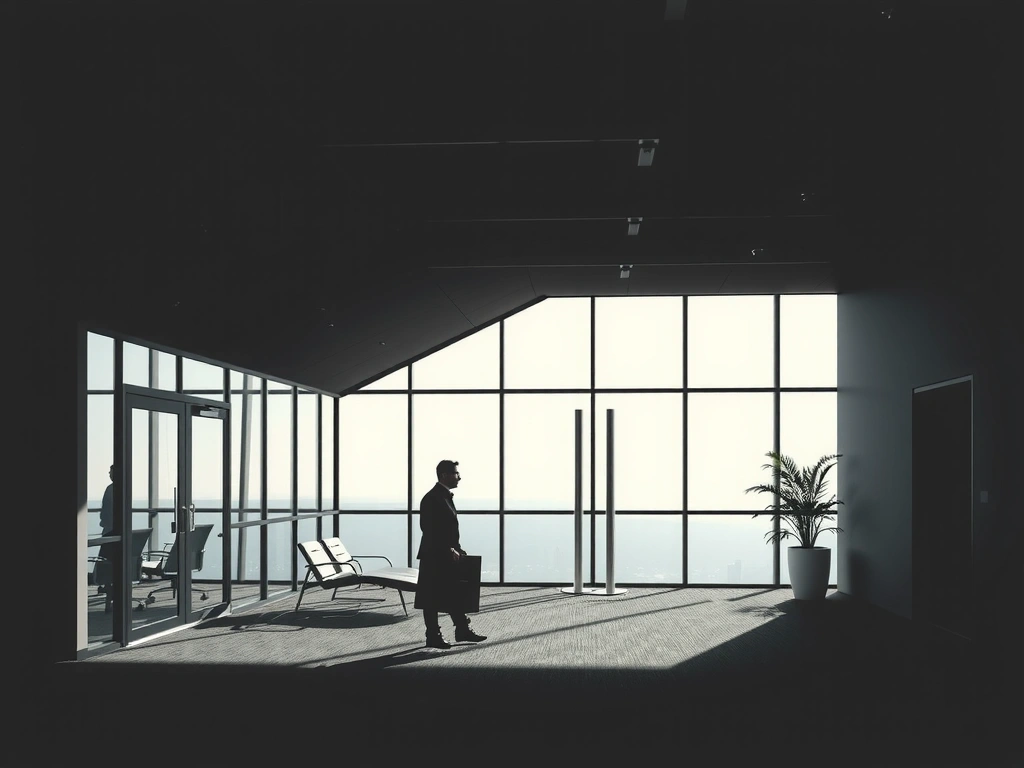
Investigating the role of white space in law firm design to establish calm authority and professional competence for a diverse client base.
Micro-interactions and transition flows that elevate the standard dashboard into a premium experience.
We decline work that relies on fleeting visual gimmicks. A digital asset for a London brand should be as durable as its physical headquarters. Our case studies represent systems designed to scale over five-year cycles, not six-month campaigns.
Contrast and readability aren't checklist items—they are the core of our "Desolate Beauty" aesthetic. High readability ensures your message reaches decision-makers regardless of their hardware or vision constraints.
Despite London's global status, mobile coverage in dense areas (like Islington or the City) fluctuates. We build light. Our average Page Speed Index is 92+, ensuring reliability across the capital.
We accept a limited number of projects each quarter to ensure direct engagement between our Lead Designer and your stakeholders.
© 2026 WebCreativeAtelier // Islington Base